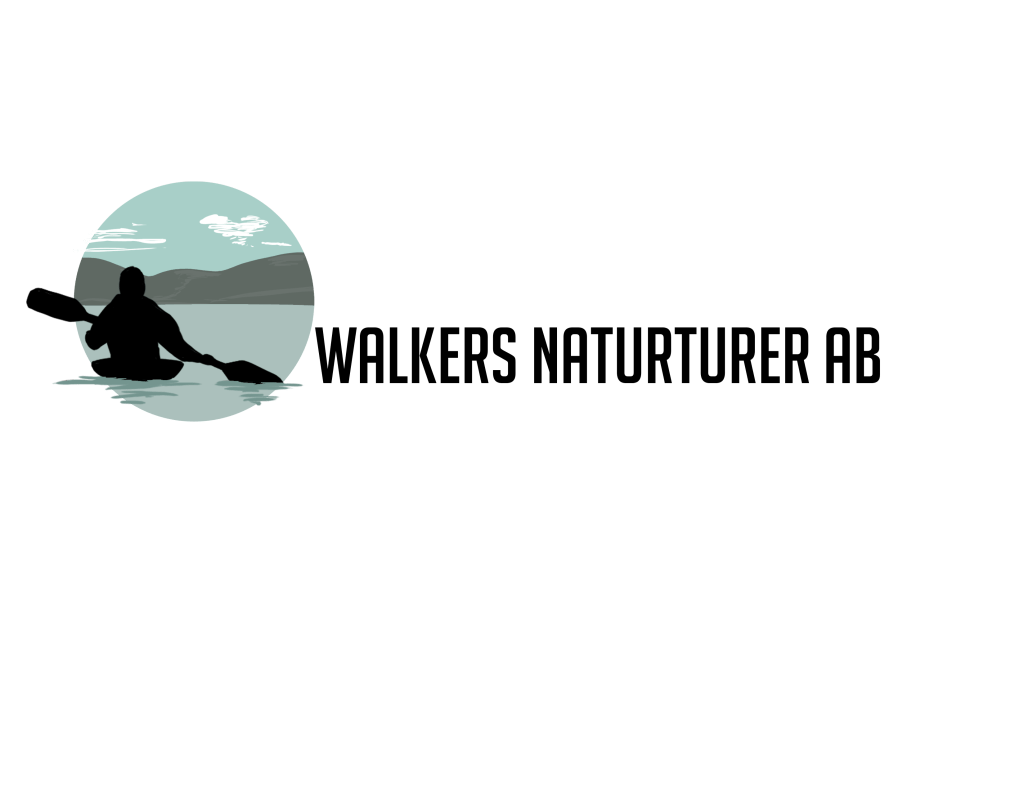
Walkers Naturturer AB is a Swedish company located in Gothenburgs northern archipelago. It’s a company located more specifically in Öckerö municipality that provides everything from guided hiking tours to kayak trips.
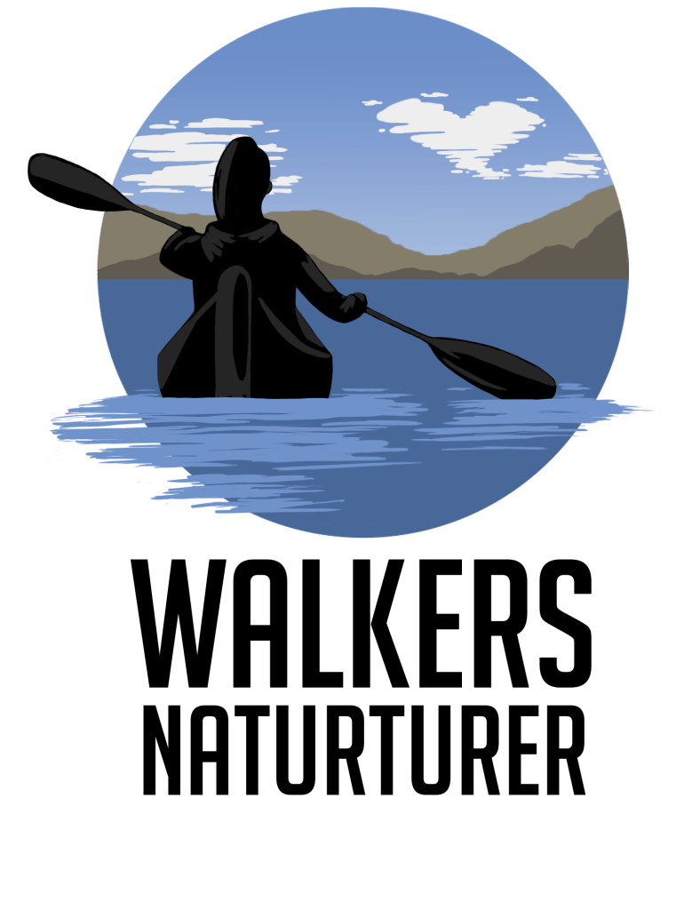
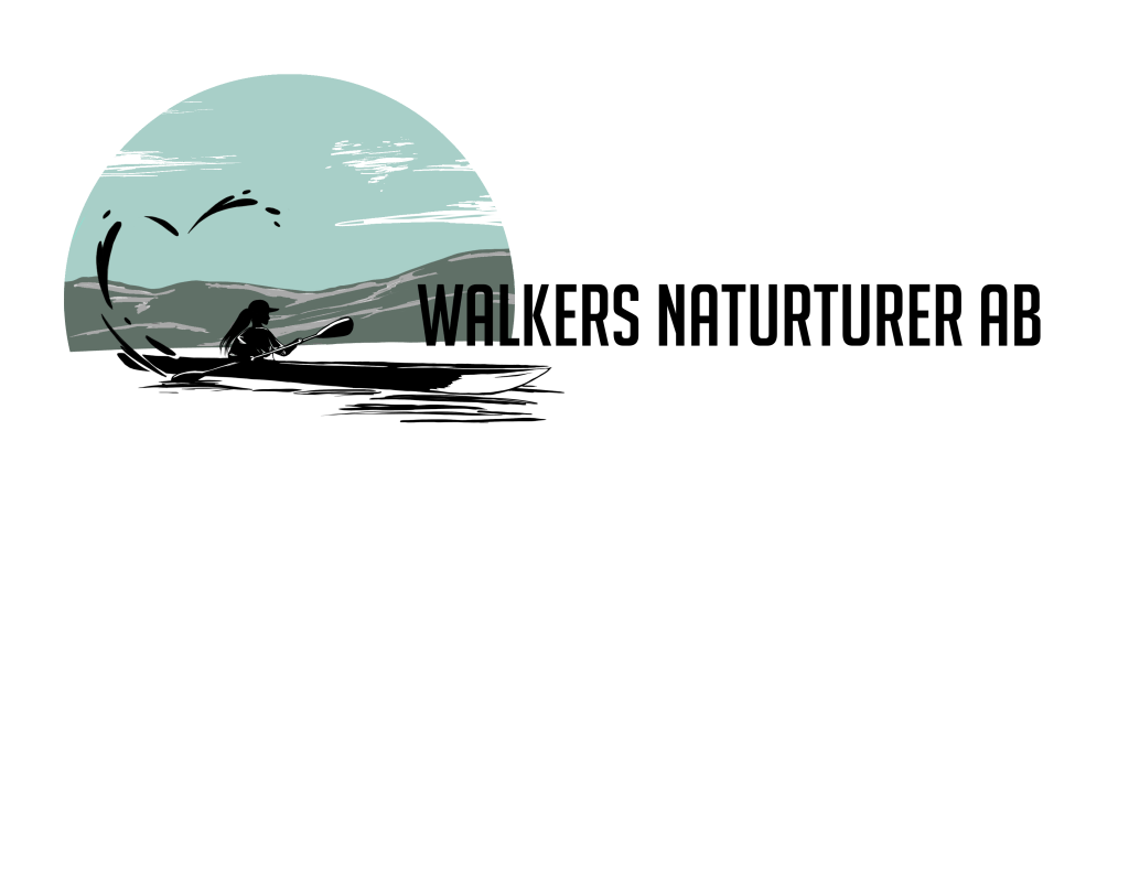
I worked with the creator of Walkers Naturturer AB in creating and designing the logotype for the company. The creator wanted to include three main things into the logotype; A heart, a symbol for walking or hiking and a kayak.

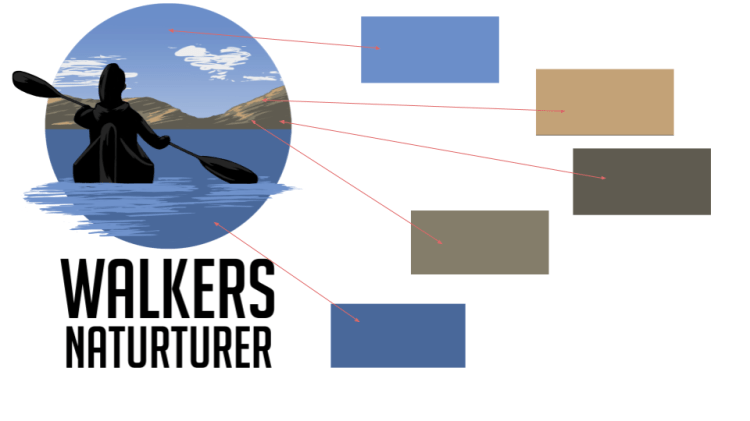
I work on the logotype while studying fulltime. Therefore, it took about 1-2 months to come up with a result, but with with back and forward communication we came to a result that matched the costumers expectation. In the end we came up with a logotype that perfectly fit the company. I also managed to include all the three requests they had for the logotype. The heart is in the cloud, the hiking and walking is symbolized with the cliffs and mountains in the background and the main focus is the kayak she asked for, which is specially designed after a photo they sent.

You can visit Walkers Naturturer ABs website here: https://www.walkersnaturturer.se/
Designprocess
The designprocess took a while, since I had to work fulltime with school at the same time, and also since the creator of Walkers Naturturer AB was a bit unsure in the beginning of what they wanted the logotype to look like.
To be able to efficiently communicate the entire process for my costumer I decided to document it in PowerPoints and documents so they could follow the process and see what I was doing and what my intentions were.
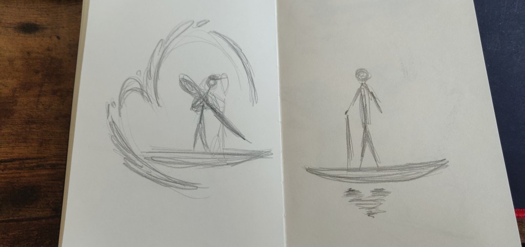
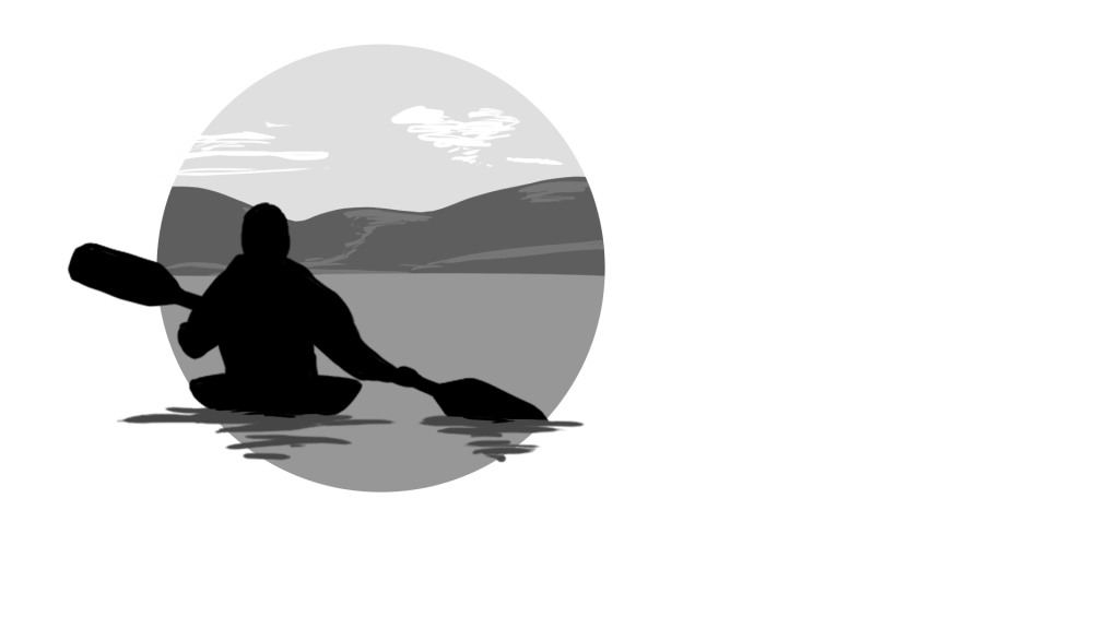
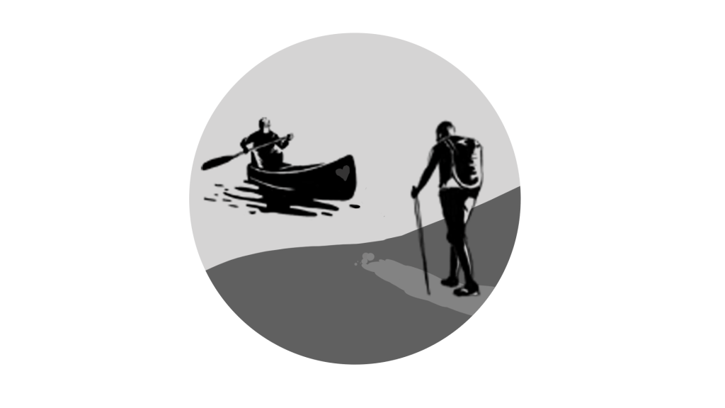
Here are a few initial sketches I made for them to view, so they could have a few referens points to follow and tell me what they liked and disliked.


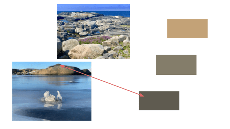
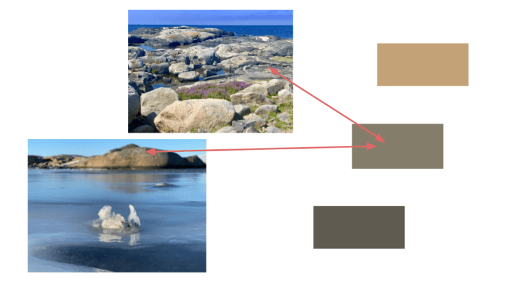
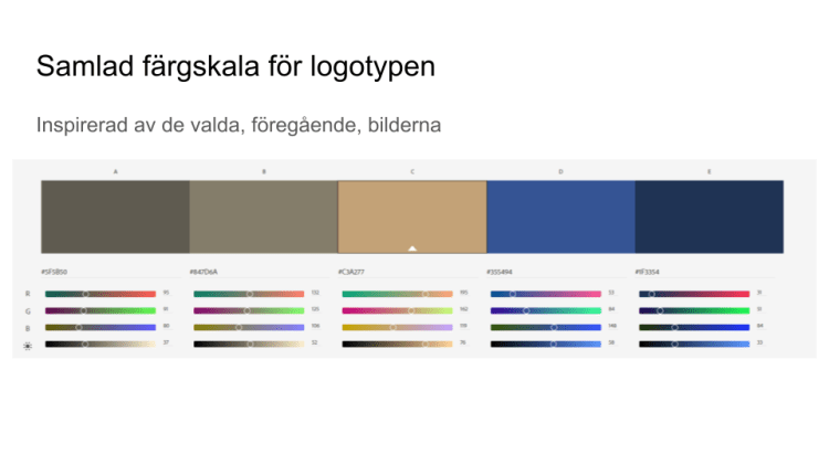
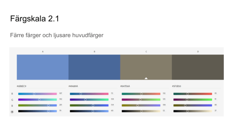
At first, my costumer wanted the logotype to be in black and white, but when I showed them a colored version they changed their mind and I started to work on a color profile that would match what their company stood for. Therefore I took a few photo of their to use as an inspiration for the color profile of the logotype. Here is a few photos that shows the work process with the colors, how I chose them and how I narrowed them down.

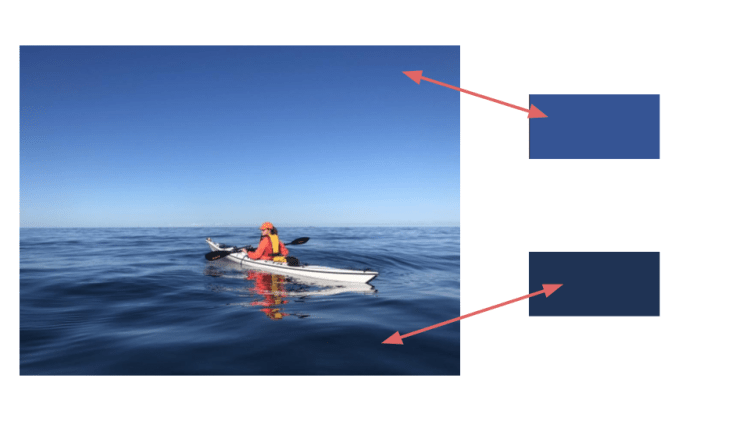

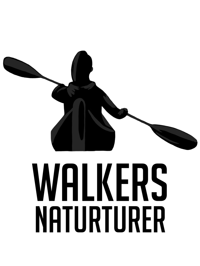
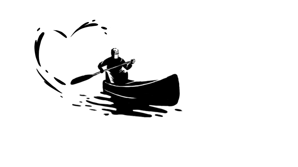
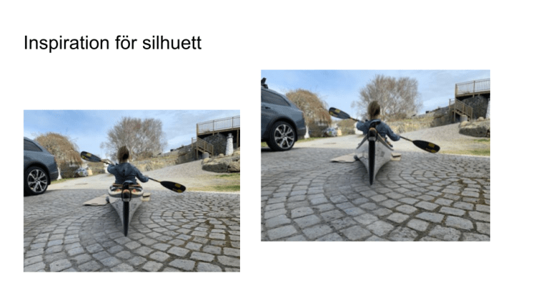
Here is also a photo of the process to perfecting the profile of the person in the kayak which was an important part of the logotype since they wanted a particular kayak to be presented in the logotype.


In the end, all the work payed of and the costumer and creator of Walkers Naturturer AB was very pleased with the finished product.
